Emergency Nurses Association
Established in 1970, the Emergency Nurses Association (ENA) sought a refreshed and forward-looking position to propel them into the next half-century. Tasked with advancing excellence in emergency nursing, ENA aspired to be the foremost organization for the global emergency nursing community, and Rule29 was poised to guide them in achieving this vision.
Industry

Services Provided
Messaging Strategy
Competitive Analysis
Copywriting and Editing
Logo Design
Brand Identity
Identity Management
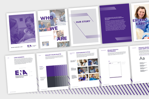
Brand Guidelines
Information Architecture and Sitemaps
B2B Website Design
Project Overview
Challenges
Conducted extensive research, interviews, and surveys to lay the groundwork for the new ENA brand
Crafting a strong logo presented a key challenge, balancing visual appeal with profound symbolism
Highlighted the incorporation of the "N" for Nurses within the negative space as a conceptual highlight, emphasizing ENA's core purpose
Solutions
Meticulously crafted a robust new ENA brand leveraging insights from research, interviews, and surveys
Developed a strong logo with the strategic placement of the "N" for Nurses within the negative space
Established a profound connection with ENA's mission through the conceptual approach, enhancing visual appeal
Results
Extension of ENA's brand narrative with the tagline "Committed to Care" resonates deeply with the emergency nursing community
Unifying message symbolizes ENA's dedication to supporting emergency nurses and nurses' commitment to their demanding field
Successful alignment of the brand with ENA's mission and vision provides a clear and impactful identity for the association as they advance excellence in emergency nursing globally
A New Era for ENA
In a pivotal move to capture the essence of the Emergency Nurses Association (ENA) for its next chapter, Rule29 designed an updated logo to breathe new life into the organization. The result is a visually compelling emblem that strategically places the "N" for Nurses within the negative space, symbolizing ENA's core mission and purpose in a way that resonates with clarity and impact.

Logo Before

Logo After

Committed to Care
Rule29 helped create the ENA Foundation logo which stands out from the main ENA brand through distinct color application on the logomark. It shares a structural arrangement and lock-up similar to the main ENA logo. The "Foundation" logotype is seamlessly placed beneath the primary logomark, extending across the entire "E-N-A." The tagline lockup follows the same design, featuring a separating line with the tagline positioned to the right. This cohesive approach ensures a unified and visually appealing representation of the ENA Foundation alongside the main brand.
Focusing In On What Matters
Through the research, interviews, and surveys, the new ENA brand was created. We developed a strong logo, where the “N” for Nurses found within the negative space conceptually draws attention to why ENA even exists. This was then extended throughout brand materials.
